
KASE Construct: Branding, Web, UI/UX Design

In November we gave you a sneak peek at our Branding for Kase Construct; today, we are showing off our new case study, which takes a deep dive into the theory behind our branding identity design, alongside a look at their newly designed Website!
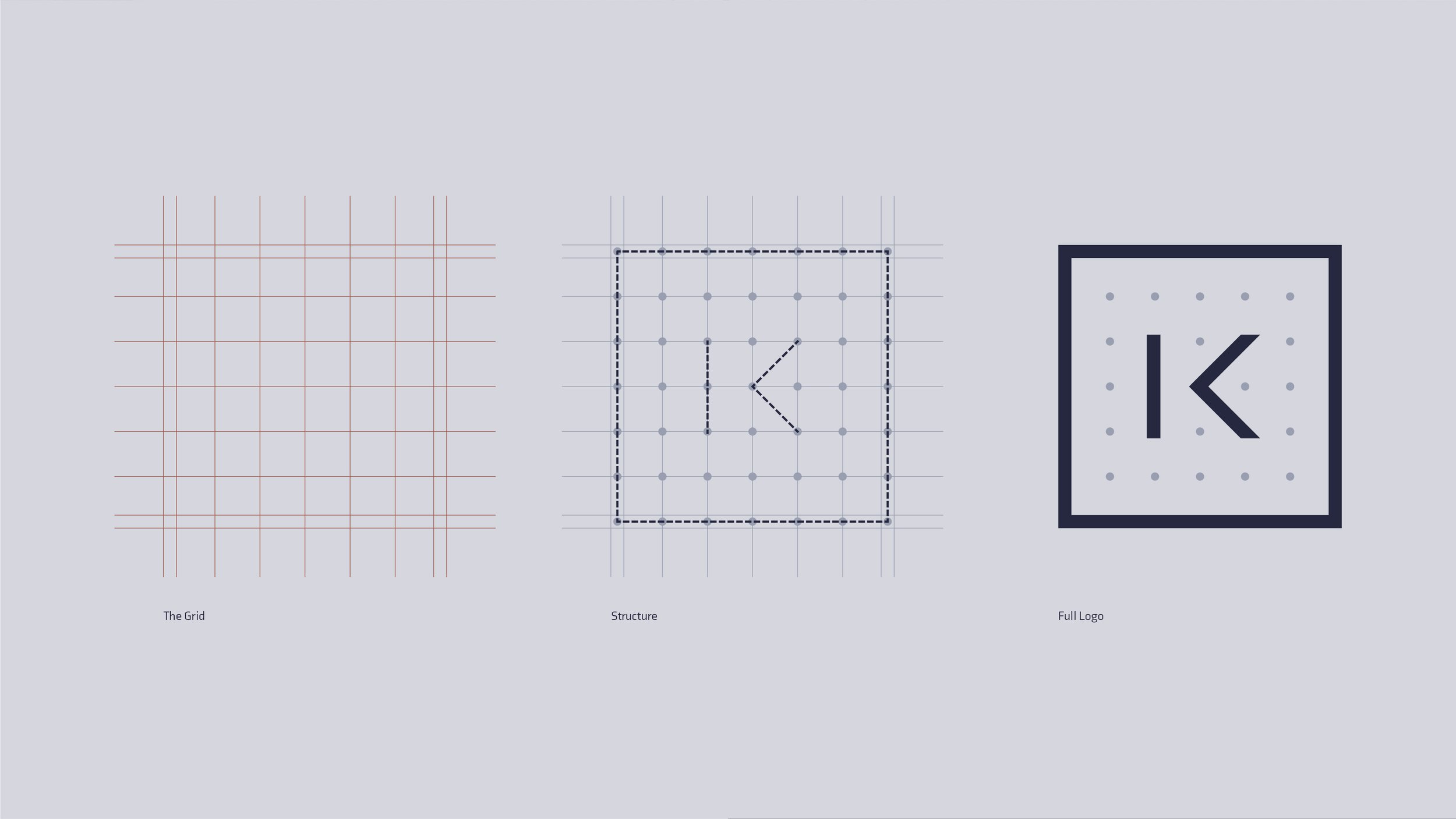
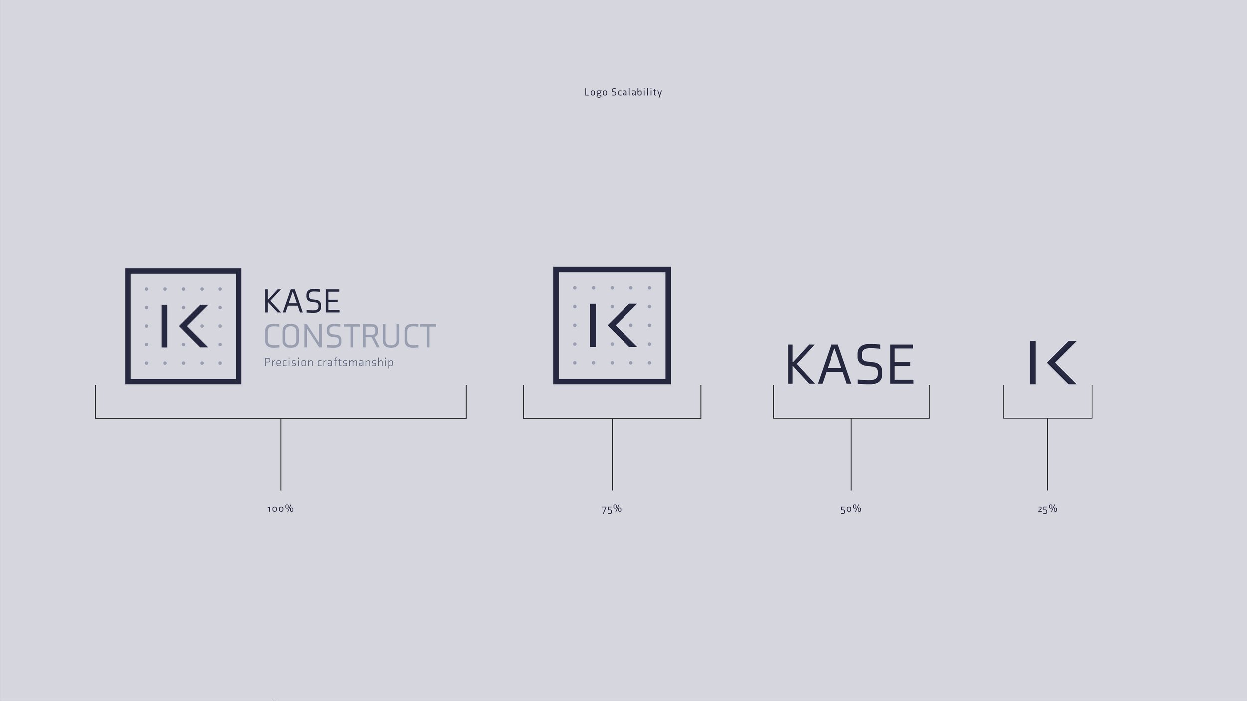
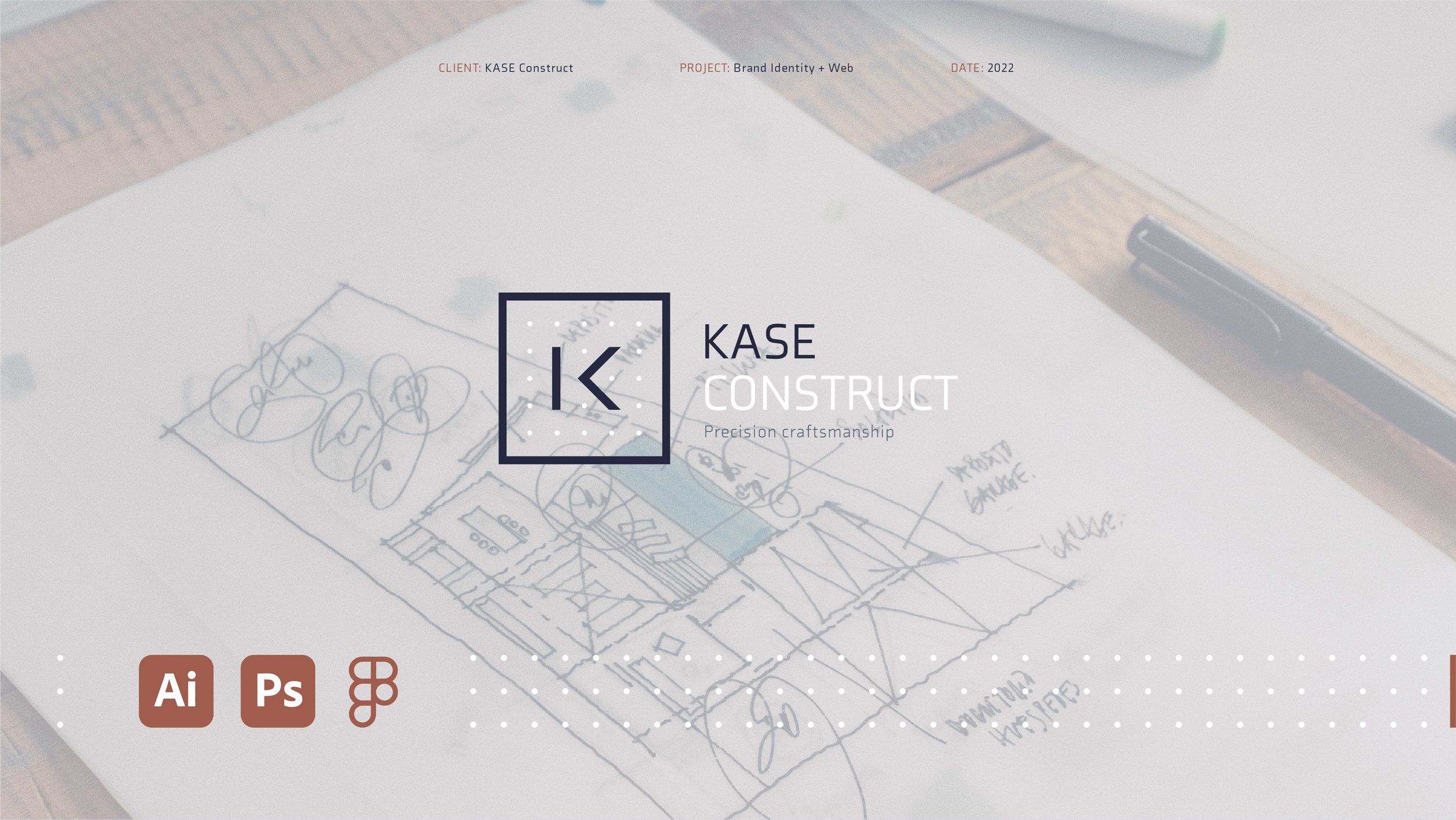
KASE Construct is all about precision craftsmanship, so we wanted to ensure their new brand identity was created with this in mind. We designed the monogram using a dotted grid surrounded by a square, representing the pure craftsmanship of the three cores of the brand, Plan, Design and build. Visually, this leans towards architecture and precise engineering; we custom-designed the 'K' within the monogram to sit precisely on the grid.
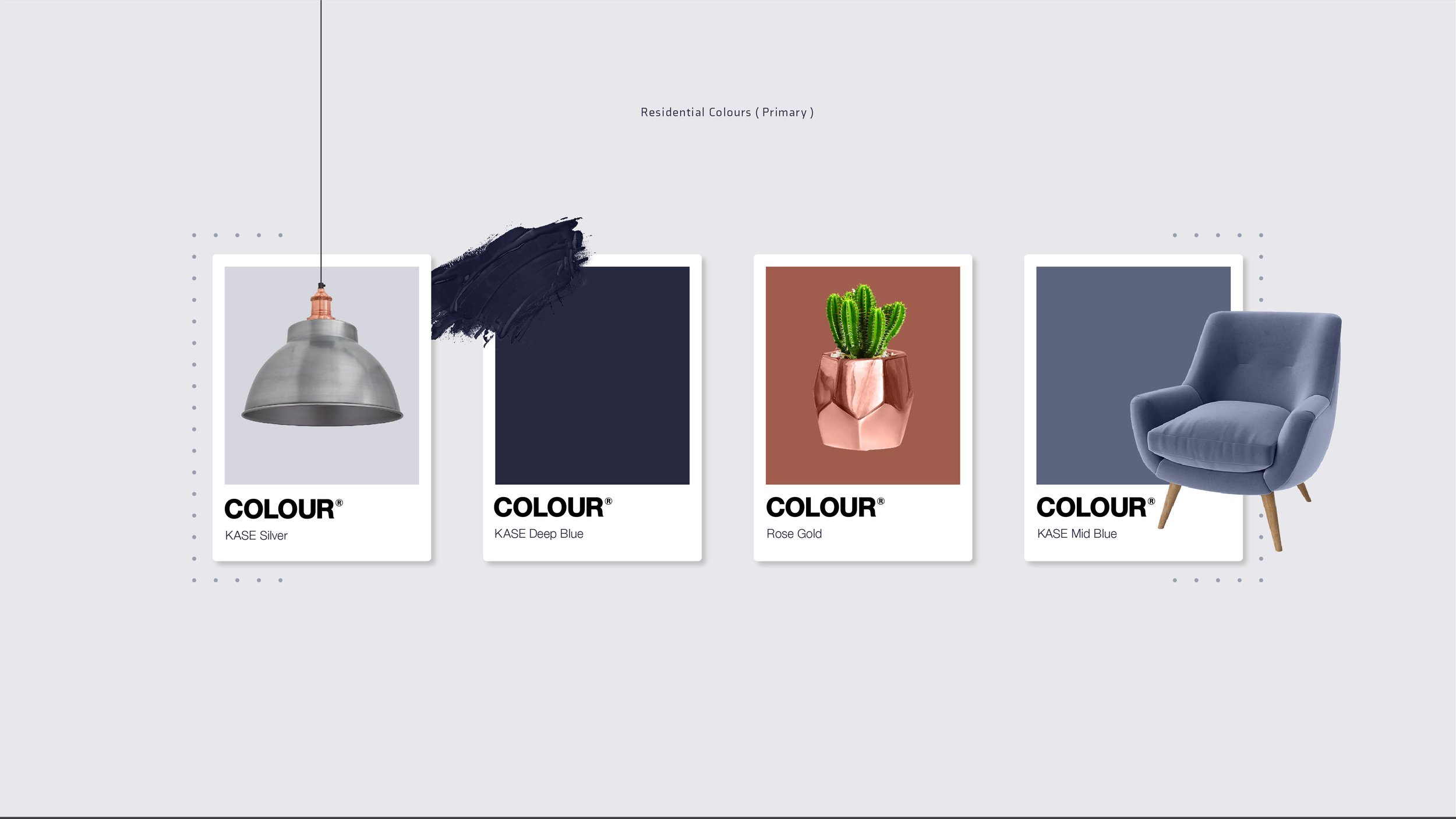

The aim was to create a brand identity that elevates this construction business to the next level through its colour language. We carefully selected a sophisticated palette consisting of a deep royal blue complimented by a bright modern silvery blue, stepping away from the norm.
There are three main pillars of the company; these are residential, commercial and industrial. The client's goal was to create a brand identity that could be used for all three, so we decided to use contrasting colours to do this. We researched the industrial industry's core colours and landed on yellow. We wanted to make sure we stood out from the crowd, so we used a shade with a gold hue. Keeping the same language, we also used a dark and clinical grey with connotations of cast iron, a robust material.
We explored a few typography options and selected 'ending'; this is a great font that balances out the style of the monogram, using a bold weight to follow the thickness of the design.
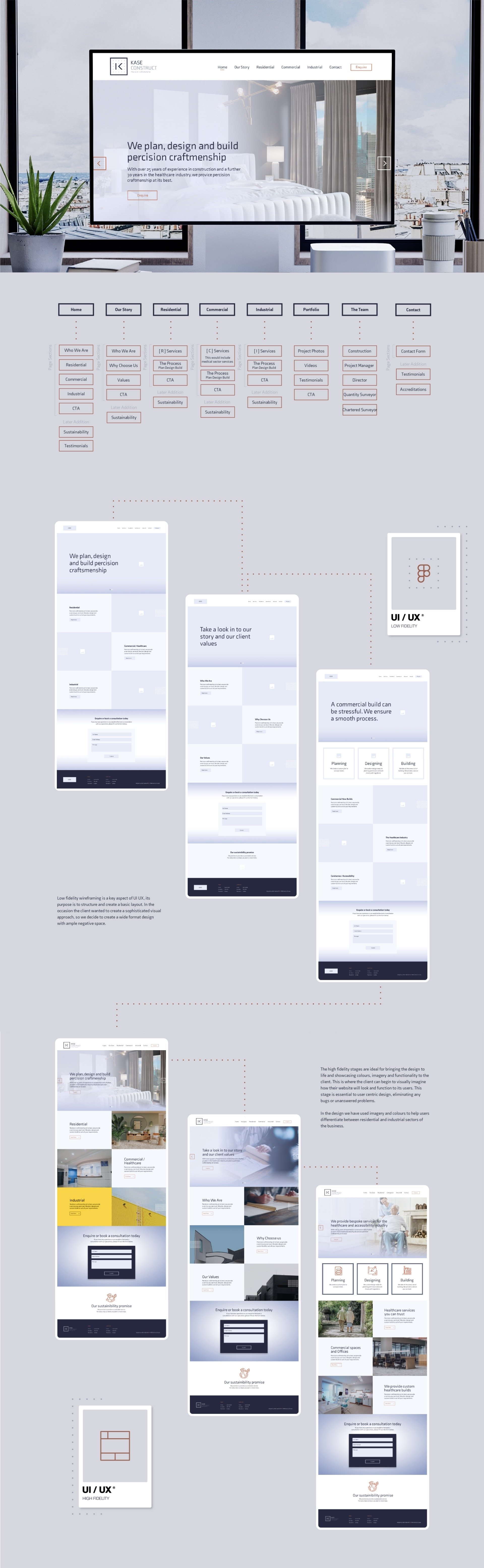
Our design team worked through low & high-fidelity UI/UX design while creating clean and refreshing designs inspired by the recent brand identity completed by our in-house team. Each page considered the user flow and customer journey while showcasing the important message KASE Construct was trying to deliver.
Upon completing UI UX Designs, our in-house development team began working on bringing the designs to life. Features light animation across each page, high-quality imagery and consistent call to action site-wide. We worked closely with the team at Kase Construct to ensure previous projects were carefully showcased and in the brand.
Once the initial structure was finalised and built into a functional website, our copywriting team got to work on producing information for the website that allowed users to easily understand what they may be requiring and keep the professional tone.
We couldn't be happier with how this turned out. Check out the website for yourself by visiting https://kaseconstruct.co.uk/ OR Get in touch with a member of the team today to discover how we can transform your website.
