Five Common Logo Design Mistakes, and How To Fix Them
60% of consumers avoid brands with ugly logos. First impressions matter, and there’s no do-overs. That’s a lot of pressure.
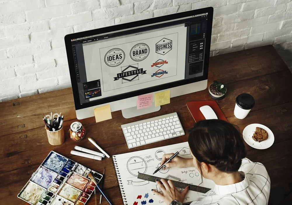
Whether you're designing your own logo or creating one for someone else, there are so many hidden traps you’ll think you’re in an Indiana Jones film. We’ve compiled a list of some of the most common logo design mistakes and even included how best to avoid them, so you can jump, swing and roll your way to the ultimate treasure: success!
Lack of research
Think about it: why are you creating a logo? Generally, logos are a form of communication. They’re a way for you to instantly express the essence of your business to potential customers and build your brand recognition in your industry. Different industries have different design best practices and target audiences with varying preferences, so it’s important to have a strong understanding of what your customers are looking for.
The mistake: Failing to research industry norms and trends, your brand’s target market and their preferences, and your brand’s objectives and messaging.
The fix: Before you start brainstorming ideas for your logo, conduct a brand audit survey to gather information about your brand’s market, strategy, competition and goals. You can then use this information in your design process to make sure the logo is relevant and impactful.
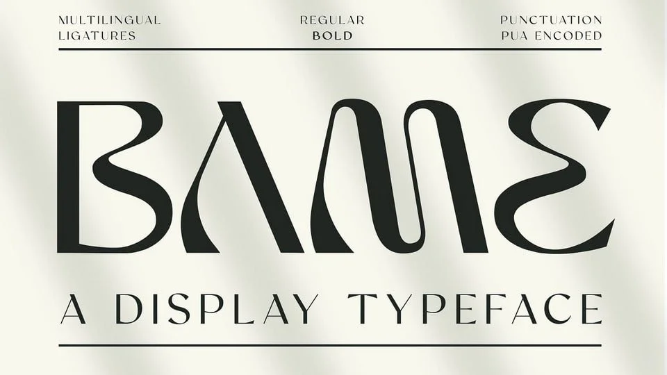
Poor font choice
Choosing a font for your brand’s logo is a lot more complex than choosing one you personally like. Every font has a different personality, and conveys a different message about your brand - so you want to make sure you’re getting it right.
Do you want to convey elegance or creativity with a script font, or would something more clean and modern fit your brand better? If so, a sans serif font might have what you’re looking for. Serif fonts portray tradition and offer a more formal tone, whilst display fonts offer something more individual and unique.
Remember, you’ll likely be using your logo across a variety of different platforms and products, so it needs to be versatile and simple enough to be easily enlarged or reduced in size.
The mistake: Choosing a font without considering its personality, how it portrays your brand, and how well you can read it when reduced in size.
The fix: Look at the logos of successful competitors and other brands which have similar messaging to your own. Identify which typeface is most suitable, and don’t mix too many fonts. Make sure to view your logo in a variety of sizes to ensure readability.
Too much clutter
When it comes to logos, simplicity is key. Whilst researching and brainstorming ideas, you’ll likely come across a whole load of interesting, eye-catching images and colours which you feel perfectly represent your brand. It can be tempting to find a way to work them all into your logo, but clutter can detract from your message and confuse your audience.
The mistake: Including lots of different colours, fonts and images in your logo, creating a complex image which doesn’t translate well when resized.
The fix: Coco Chanel said that before she leaves the house, she looks in the mirror and takes off one accessory. Apply that rule to your logo - keep it simple with a maximum of three colours, one or two fonts, limited words and one striking, memorable icon.
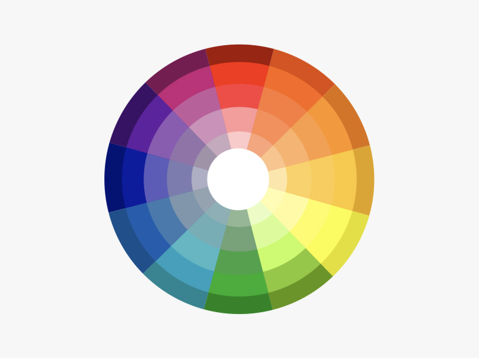
Poor colour choice
Whether we’re aware of it or not, the different colours used in logos have an effect on our psychology when we look at them. Nickelodeon’s bright orange logo conveys energy and playfulness - the perfect message for a children’s television channel. Meanwhile, PayPal’s mix of two shades of blue convey wisdom and stability. Imagine if the colours of these logos were swapped: the messages would be totally different.
From your research, you’ll know which feelings you want your logo to portray. If you’re looking for an air of luxury to surround your brand, think about choosing purple or black. Gray is a classic colour which shows your brand is efficient, practical, traditional. Brighter colours like yellow and orange portray youthfulness and fun, whilst green is often associated with health and wealth.
The mistake: Choosing your favourite colour without considering its message.
The fix: Research the psychology behind various logo colours, and common associations with them. Choose one colour, or mix two or three complementary colours or shades. Avoid overcrowding your logo with too many colours, or none of their messages will come through.
Saving in the wrong format
When you’ve finalised your logo design, you’ll want to save it so you can upload and share it across your platforms. For this to happen, you’ll need to resize your logo for each instance: sometimes it will be enlarged, sometimes the size will be reduced. This will also change the amount of pixels in your image, reducing the quality.
To avoid this, save your logo as a vector file. Instead of being based on pixels, these files use maths to create your image. This means you can resize it to your heart’s content without losing any quality! Common vector formats include PDF, EPS and SVG.
You may want to create an additional, pixel-based (raster) copy of your logo, as these files tend to be smaller and thus easier to upload and share. In this case, PNGs are an ideal format to use, as they support transparent backgrounds.
The mistake: Saving your logo as a JPEG or another raster file, which reduces the quality of your logo when enlarged.
The fix: Save your original logo as a vector file such as a PDF, SVG or EPS. Create a raster copy if needed such as a PNG, as it can be easier to share.
Do you need help creating the perfect logo for your brand?
At UNBXD, we have a team of design experts on hand to create recognisable, distinctive logos in line with your brand’s identity.
Our brand identity services also include brand naming, brand guideline design, brochure design, signage design, packaging design and brand consultancy.