
Typography Troubles: How To Choose The Right Font
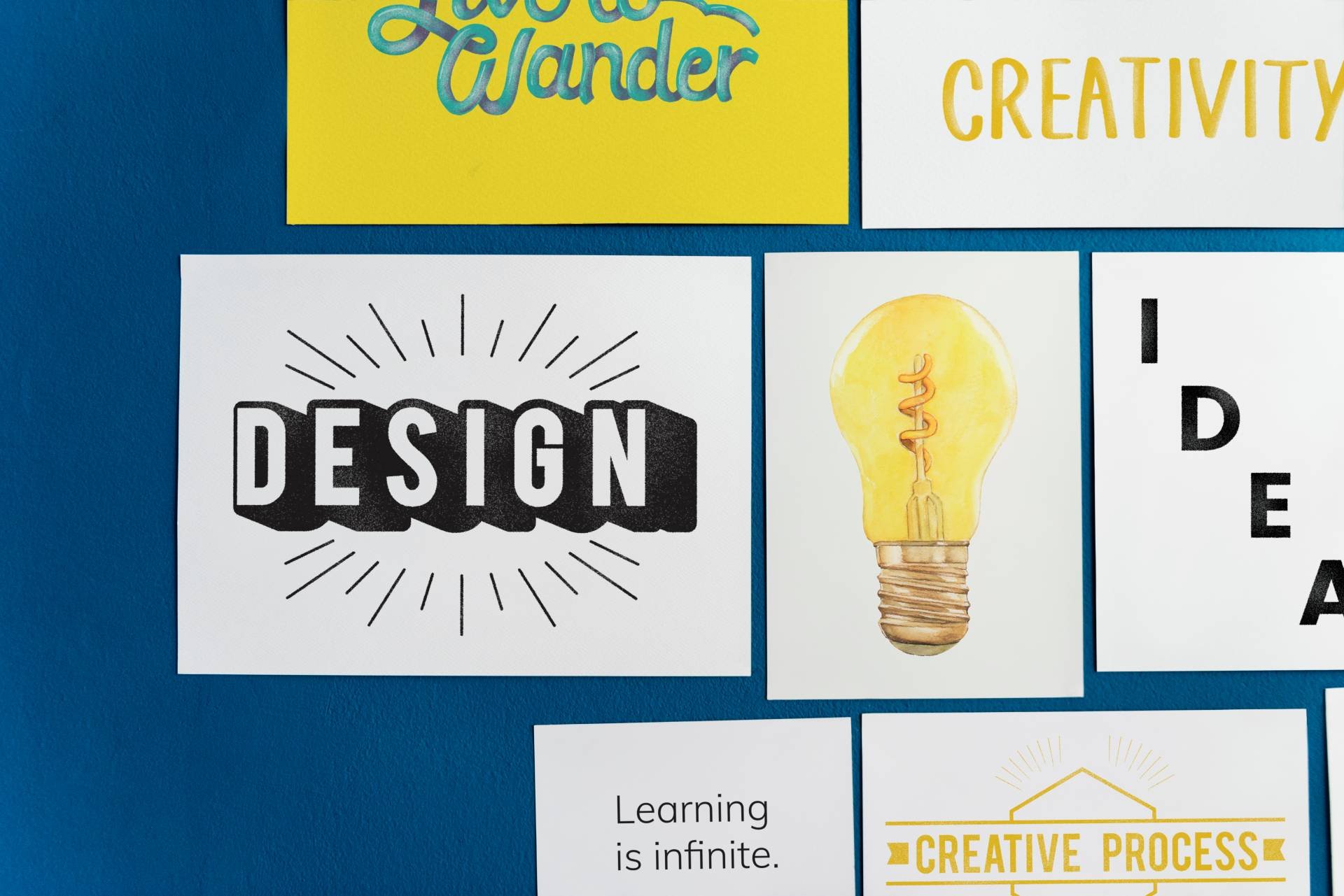
What is typography?
Typography is the art of arranging types to create visually pleasing, interesting, and effective text through the careful selection of typefaces, font sizes, line lengths, and spacing.
Good typography enhances the readability and clarity of the text while also conveying the intended tone and style. It's a fundamental aspect of design, influencing how information is perceived and understood by readers in both print and digital media.
Fonts vs Typefaces
The terms "font" and "typeface" are often used interchangeably, but they actually refer to different aspects of typography.
A typeface is the overall design concept of a set of characters that share similar visual characteristics. Each font within a typeface has its own unique characteristics, but they all share the same basic design elements.
In short, fonts are variations of typefaces - for example, Arial is a typeface, and Arial Bold is a font.

Understanding various typefaces
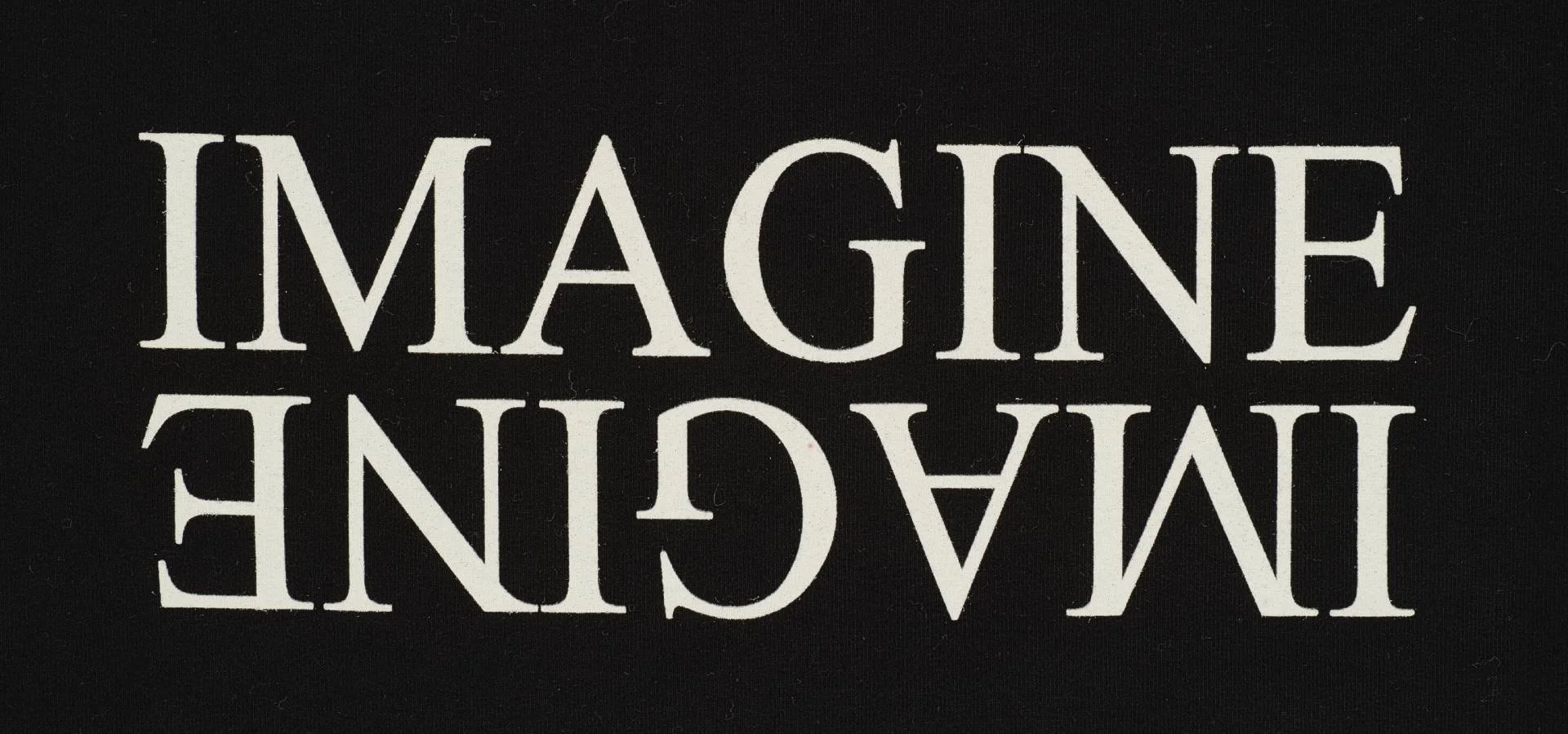
Serif Typefaces
Serif typefaces are characterised by the presence of small lines, or "serifs," at the ends of strokes on the letters. These serifs can be subtle or more pronounced, depending on the specific typeface. Serif typefaces are often associated with traditional and formal designs, and they are commonly used in print media such as books, newspapers, and magazines.
Serif typefaces are known for enhancing readability in printed text, particularly in long passages, as the serifs help guide the reader's eye along the lines of text. The serifs also contribute to the overall aesthetic appeal of the typeface, giving it a classic and elegant appearance.
Some popular examples of serif typefaces include Times New Roman, Georgia, Garamond, and Baskerville. Despite their traditional associations, serif typefaces are also used in digital design, particularly for websites and documents where readability and professionalism are important.
Sans-serif Typefaces
Sans serif typefaces, as the name suggests, are typefaces that lack the small projecting features called serifs at the end of strokes. The term "sans serif" is derived from the French word "sans," meaning "without," and "serif." Sans serif typefaces are characterised by their clean, modern, and often minimalistic appearance.
These typefaces are commonly used in digital media, such as websites, presentations, and on-screen text, as well as in signage and advertising. They are also popular for their versatility and readability, especially at smaller sizes or on low-resolution screens, where serifs might become less distinct.
Sans serif typefaces are typically perceived as more informal and contemporary compared to serif typefaces. Some popular examples of sans serif typefaces include Arial, Helvetica, Verdana, and Futura. Their simplicity and clarity make them suitable for a wide range of design applications, from branding and editorial design to user interfaces and wayfinding systems.
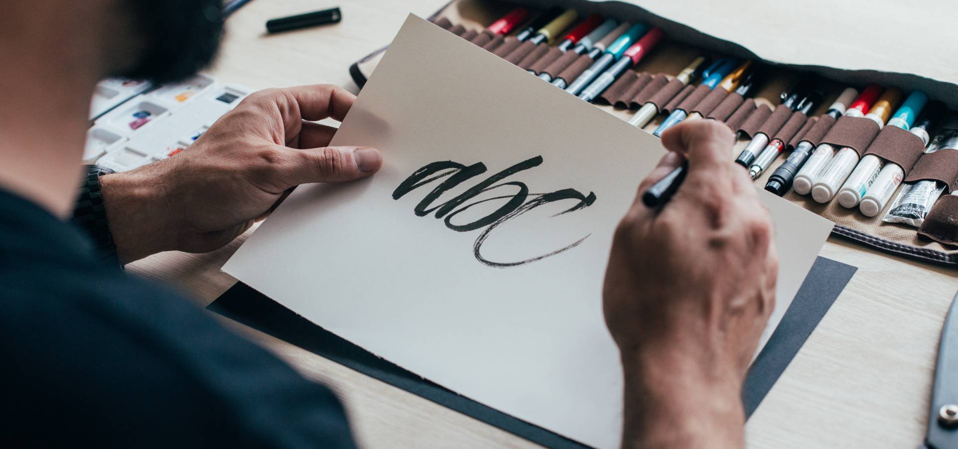
Script Typefaces
Script typefaces mimic the fluid strokes and flourishes of traditional handwriting or calligraphy, lending a sense of elegance, warmth, and personality to text. They can range from formal and traditional to casual and playful, depending on their design.
Script typefaces are often used for decorative purposes, such as invitations, greeting cards, wedding stationery, and branding materials where a personal touch is desired. They can also be used sparingly for headlines or logos to add emphasis or evoke a specific mood.
More formal scripts emulate traditional calligraphy styles with elaborate flourishes and swashes. They are often used for formal occasions and upscale designs, whilst casual scripts have a more relaxed appearance, resembling everyday handwriting. Brush scripts mimic the look of brushstrokes and have a dynamic and expressive quality, often used for designs that require a bold and energetic feel. When using script typefaces, it's important to consider legibility, especially at smaller sizes or in longer passages of text, as some script fonts can be challenging to read.
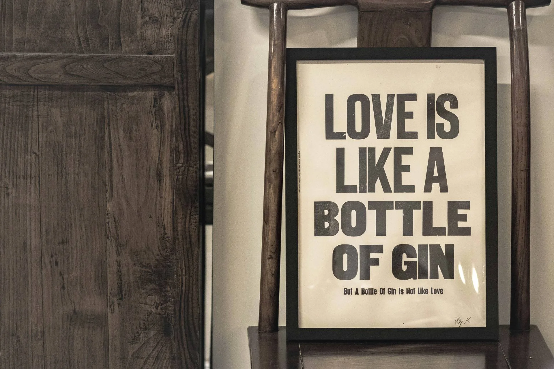
Display Typefaces
Display typefaces are fonts designed primarily for decorative or stylized purposes rather than for readability in body text. These typefaces often feature unique and eye-catching designs, with elaborate shapes, intricate details, and unconventional letterforms.
Decorative typefaces are used to add visual interest, personality, and flair to design projects. They are commonly used in headlines, logos, posters, banners, packaging, and other graphic design elements where the emphasis is on creativity and aesthetics rather than readability.
These typefaces come in a wide range of styles, themes, and inspirations, from retro and vintage to organic and natural. They are best used in conjunction with a more conventional, legible typeface to create contrast and a clear visual hierarchy in your composition.
How to choose the best fonts for your brand
Understand your brand
Different fonts convey different feelings, impacting the way people view your brand.
Get inspired
There are millions of different typefaces out there, so you can’t possibly already know them all. Take some time to do some research and get inspired by brands and designers you admire. This will give you more ideas of font types, combinations and designs for your own brand.
Consider creating a visual moodboard - you could even create several if you’re not sure which mood is best for your brand. Take a look at other examples and then figure out which fits your desired identity the most.
Avoid overused fonts
It’s probably a good rule of thumb to avoid any fonts which you can name just by looking at them. Times New Roman, Arial, Helvetica, Papyrus, Garamond, Comic Sans - these typefaces have all taken on a life of their own. Everyone recognises them, and as great as some of them can be for various uses, they can make it difficult to stand out. Examples like Papyrus and Comic Sans can look cheesy and like your concept has been underdeveloped.
You don’t want to be like everyone else, so dig around and find some more unique fonts!
Pick your title font first
Your title font is where you have the opportunity to be particularly creative, especially if you’re going for a whimsical script font or an eye-catching display font. With this in mind, it’s best to pick the font you’ll be using for your titles or headings first, and then match your secondary font to your title font.
Create contrast
Choosing contrasting fonts - for example, something bold and serif for the title and a contemporary sans-serif font for everything else - will help you to create a visual hierarchy within your design. The eye of the viewer will first be directed to the main font, and will naturally trail to the next font, and so on. This increases readability as well as visual intrigue.
Don’t choose too many fonts
There’s so many great fonts out there that it can be tempting to pick more and more to represent your brand until you realise you’ve got seven and things are looking cluttered. As well as being too confusing for the reader, disrupting the flow of the text, you can begin to muddy your message and lose your brand identity. Less is more here, so stick to two or three fonts - headings, subheadings, and body.
Choosing the perfect font for your brand is just one element of the wider process of creating a strong brand identity, building awareness and recognition, and ultimately achieving your goals. Check out our blog - The Ultimate Guide To Creating Your Brand Identity.
UNBXD is a Creative Digital Agency which specialises in social media marketing to create exciting, innovative solutions for breakthrough brands. We are experts in supporting brands to outline clear objectives, develop strong communication strategies and create unique content which truly engages their audience. Come and see what we can do for you!
