
Logo Design Trends to Avoid in 2023

Your brand’s logo is used everywhere. On a website, social media profiles, business cards, adverts, videos, uniforms, posters, emails - even down to those novelty company pens you’ve got your eye on. If you need to redesign your logo or rebrand later down the line, it can take a lot of time and effort, cost a lot of money, and lose you a lot of that hard-earned brand recognition we’re always banging on about.
We can all look back on our teenage years and pick out a few embarrassing trends we swore were cool. And maybe they were, back then - but leather trench coats, tiny decorative ties and unimaginably large, floppy collars have truly had their time.
The trends we’ll be taking you through in this blog are the galaxy print leggings of the logo designing industry. Relics from bygone eras, all the rage just a few years ago: but now, sure-fire ways to make your branding look either dated or forgettable.
MIXED TYPOGRAPHY LOGOS
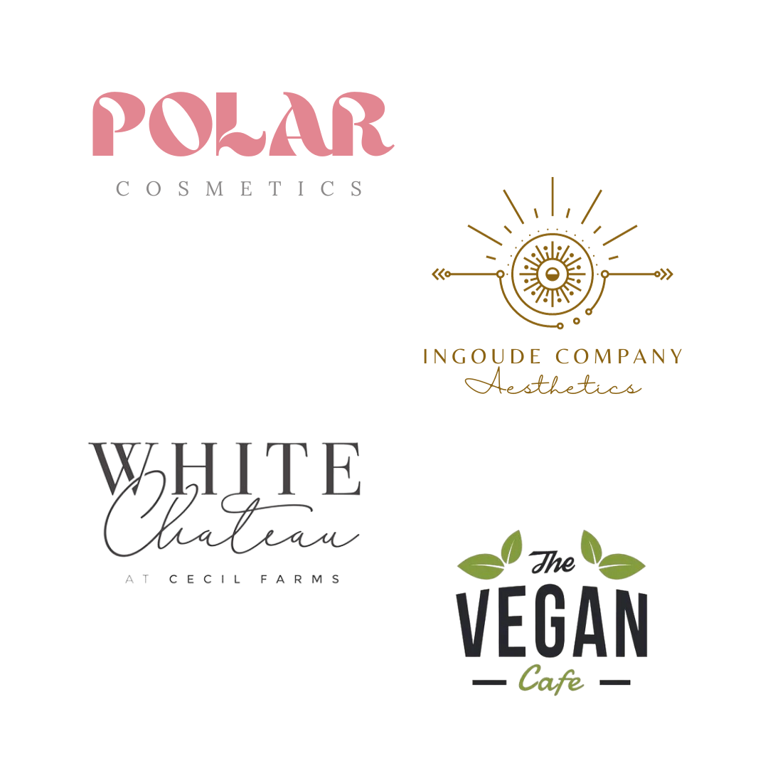
These down-to-earth, jazzy mixed-font logos can be absolutely beautiful, but, as my mum says, good looks aren’t everything! The skinny fonts used in many of these logo designs are very pretty and wonderfully dainty, but have limited scalability: your logo should be effective in any format, from social media profile pictures to giant billboards. These fonts can be difficult to read when sized down onto packaging or business cards.
Using too many different fonts can also make your design become cluttered, inconsistent and confusing. Even if you do design a clear, versatile logo, this trend has become so popular that it will be difficult for your branding to stand out amongst the crowd.
STYLISED MONOGRAM LOGOS

A true staple in the corporate world, these stylised initial logos feel like a quick fix - take the initials of the company, pop them in a circle, make the A into a triangle or whack a ‘swoosh’ on it, and you’re done. This design makes it hard to remember a brand’s name and logo, and even harder to deduce what the company is all about. This is definitely a trend we’d love to see left in the past.
WATERCOLOUR LOGOS

Just like many modern mixed-font logos, these watercolour logos are so very pretty. They tend to feature a simple watercolour design - usually pastel - used as a background for a font or a mix of fonts. They have similar issues to the plain mixed-font logos in that scalability is limited, plus digitising these logos can cause them to come out looking pixelated.
On top of that, these are just pretty outdated - they used to be a great way to give your logo and online presence a handmade touch, but their effectiveness has slipped away over time.
CLICHE ELEMENT LOGOS

In logo design, everyone talks about brand messaging. Make sure you’re getting the right message across. Make sure your message is clear. Make sure people can remember your message.
The logical response to this would be to stick to something ‘on the nose’ - think teeth for dentists, hearts for healthcare and cutlery for caterers. There’s no room for incorrect interpretation, no way your message will be lost - it’s foolproof, right?
Wrong. If every construction company has a hammer in its logo, what will make yours stand out to the person looking for builders? How will potential clients remember your IT solutions company if your blue globe looks just like everyone else’s blue globe?
Unfortunately, the business world is a saturated place. This means you have to balance the art of standing out with the art of getting across your message. Luckily, there are ways to do this outside of icons and images. Think about how incorporating colours and fonts can change people’s perception of your brand, and research more abstract imagery. If it’s the first thing you think of, it probably shouldn’t be the last.
OVERUSED FONTS

Oh, Helvetica. My old friend.
Helvetica is also a good friend of many famous brands - Microsoft, Panasonic, Toyota, Nestle and Jeep, to name a few. However, this doesn’t necessarily mean Helvetica will be friends with you.
Remember that these huge brands had equally huge marketing budgets to ensure the success of their logo redesigns from more complex symbol or combination logos to simple wordmarks. Using a simple, popular typeface as an emerging brand will probably not help you to emulate their success.
DO YOU NEED HELP CREATING THE PERFECT LOGO FOR YOUR BRAND?
At UNBXD, we have a team of design experts on hand to create recognisable, distinctive logos in line with your brand’s identity. Our brand identity services also include brand naming, brand guideline design, brochure design, signage design, packaging design and brand consultancy.
