
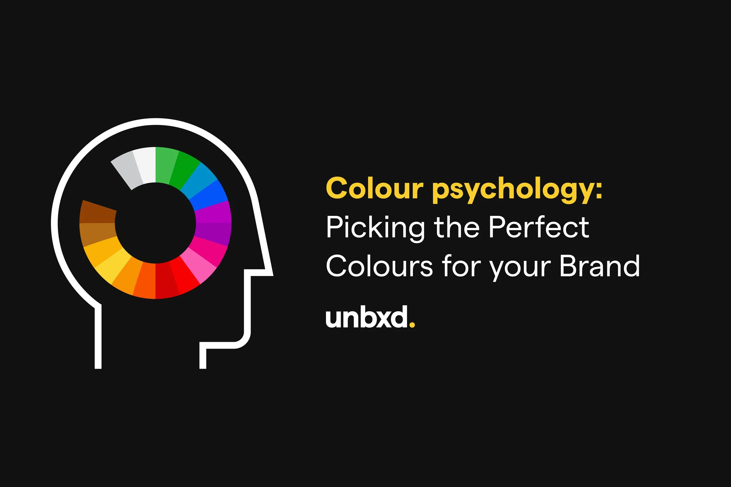
Colour Psychology: How Different Colours Have Different Meanings (With Examples!)
When you’re choosing the perfect brand colours for your business, it can be tempting to pick your favourites. However, pink might not be the best choice for a lemon-flavoured drink, just as yellow might not be the best choice for a designer brand.
Colours are subjective, yes - they’re always up for interpretation and different people may have different ideas of what colours mean to them. Personal experiences, cultures and preferences have a huge impact on the effect of colours on consumers, which means there’s a limit to how accurately we can predict these reactions using colour psychology.
Colour psychology in marketing refers to the study of how colours affect perceptions and behaviours of consumers. Colour psychology can be a useful tool in building brand recognition: banks need to appear trustworthy, designer brands need to appear sophisticated, and wellness brands need to appear peaceful. Your choice of colour won’t work any miracles, but it can be a great starting point.
It can also be worth looking at your competitors, and the colours they choose for their branding. Many car logos lean towards silver, and many chocolatiers choose brown. Choosing a different colour without losing your brand’s messaging can help you stand out amongst the crowd. Just look at Cadbury!
In this blog, we’ll be taking a look at some of the most popular colours and colour combinations used in some of the world’s most famous logos, as well as how these colours are commonly interpreted. Remember, it’s not all about colour - choices such as font, design, icons, names and even your industry all have an impact on how people view your brand when they see your logo for the first time. Take a look at our blogs on Logo Design Trends to Avoid in 2023 and 7 Types of Logos to Consider for Your Brand.
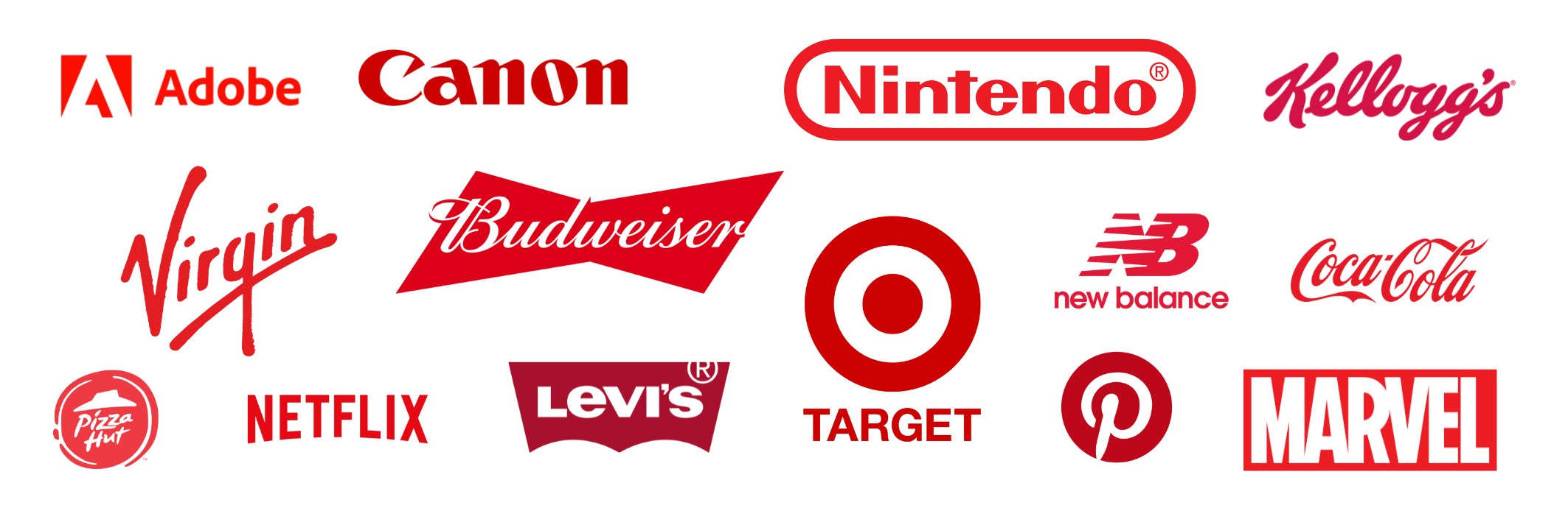
Famous Red Logos
Red Colour Psychology
Red is all about passion, energy, and excitement, making it a go-to choice for brands that want to light a fire under their audience. It's the colour of confidence and a guaranteed head-turner, perfect for brands that want to shine in a crowded market. But red isn't just about grabbing attention; it's also about spreading love and warmth, creating a sense of connection and trust.
Popular brands which use red in their branding include Adobe, Netflix and Coca-Cola.
The Personality of the Colour Red:
Action
Strength
Passion
Courage
Confidence
Energy
Determination
Love
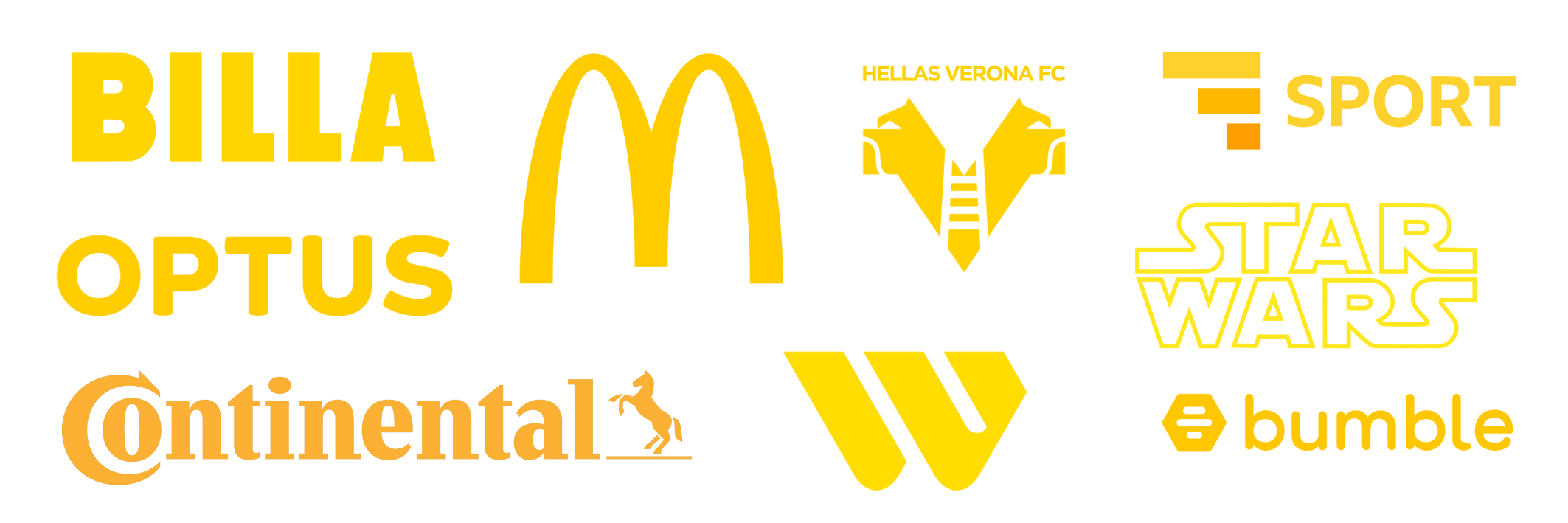
Famous Yellow Logos
Yellow Colour Psychology
Yellow is like the sunshine of branding, bringing a sense of joy, optimism, and warmth to any brand's identity. It's the colour of happiness, radiating a friendly and approachable vibe, making it ideal for brands looking to spread cheerfulness or create an inviting atmosphere such as those in the food or entertainment industries.
Popular brands which use yellow in their branding include McDonald’s, BBC Sport and Bumble.
The Personality of the Colour Yellow:
Happiness
Optimism
Positivity
Energy
Fun
Inspiration
Joy
Warmth

Famous Green Logos
Green Colour Psychology
Green in branding is a symbol of growth and renewal. It's associated with nature, harmony, and sustainability, making it an excellent choice for brands that want to convey a sense of eco-friendliness and a commitment to the environment such as Greenpeace. Green also represents balance and tranquillity, which can be appealing to brands aiming to foster a sense of calm and well-being. This versatile colour can also evoke feelings of trust and reliability, making it a great fit for brands in industries like finance and healthcare.
Popular brands which use green in their branding include Starbucks, Spotify and Xbox.
The Personality of the Colour Green:
Nature
Safety
Luck
Hope
Generosity
Calm
Growth
Balance
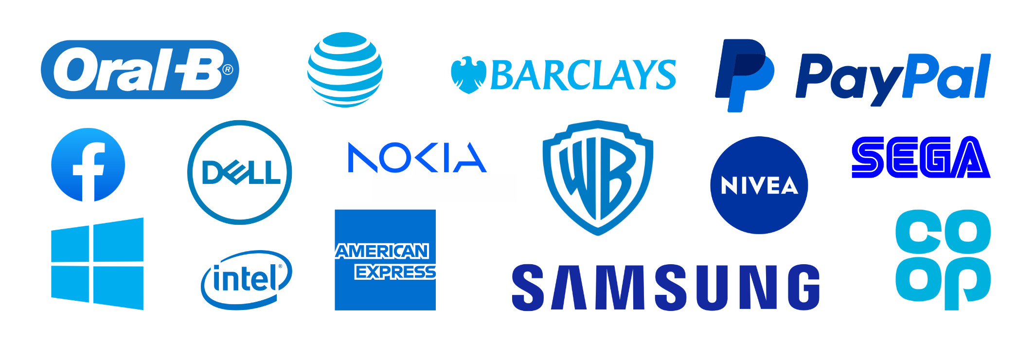
Famous Blue Logos
Blue Colour Psychology
In marketing, blue often represents trust and security, which is why brands that choose blue often aim to build a strong sense of trust with their audience, making it a popular choice in industries such as finance, technology, and healthcare. Blue can also evoke a sense of professionalism and competence, making it an ideal colour for corporate branding. As blue is so commonly used in certain industries, it’s important to make sure your own brand doesn’t fade into the background.
Popular brands which use blue in their branding include PayPal, Oral-B and Dell.
The Personality of the Colour Blue:
Security
Loyalty
Trust
Confidence
Reliability
Honesty
Protection
Calm
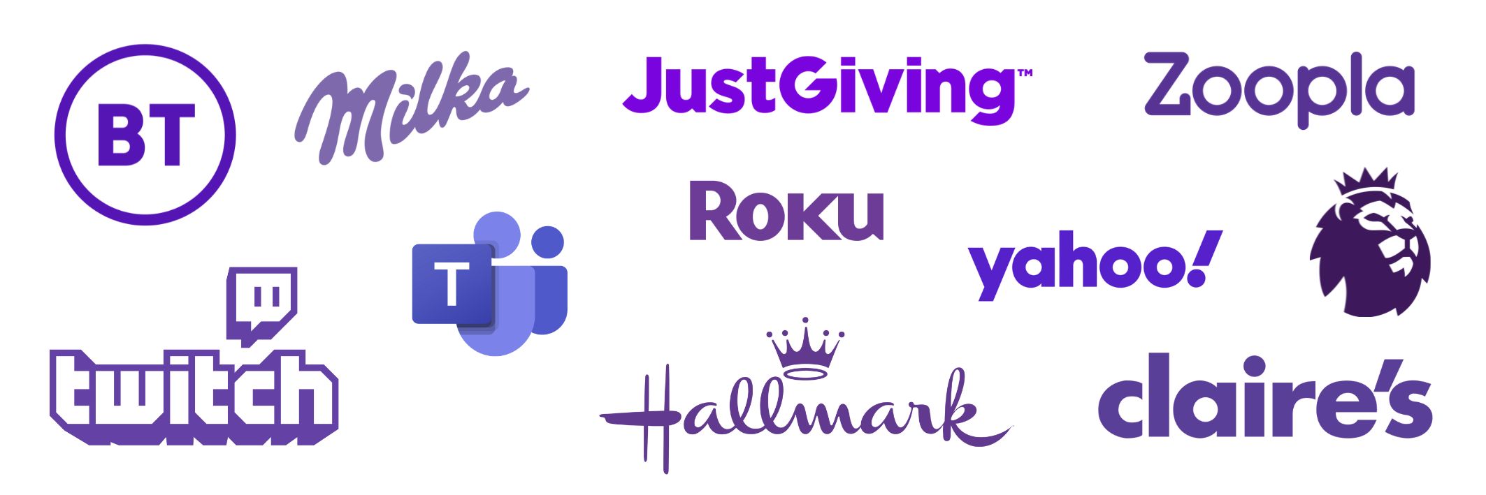
Famous Purple Logos
Purple Colour Psychology
Purple embodies luxury, imagination and spirituality. The way this colour evokes feelings of creativity makes it ideal for brands which are innovative or artistic in nature. Like all colours, the shade of purple matters, with darker purples leaning more towards luxury and lighter purples conveying a softer, more whimsical feel.
Popular brands which use purple in their branding include Twitch, Claire’s and Milka.
The Personality of the Colour Purple:
Imagination
Inspiration
Royalty
Wealth
Mystery
Brave
Unique
Magic
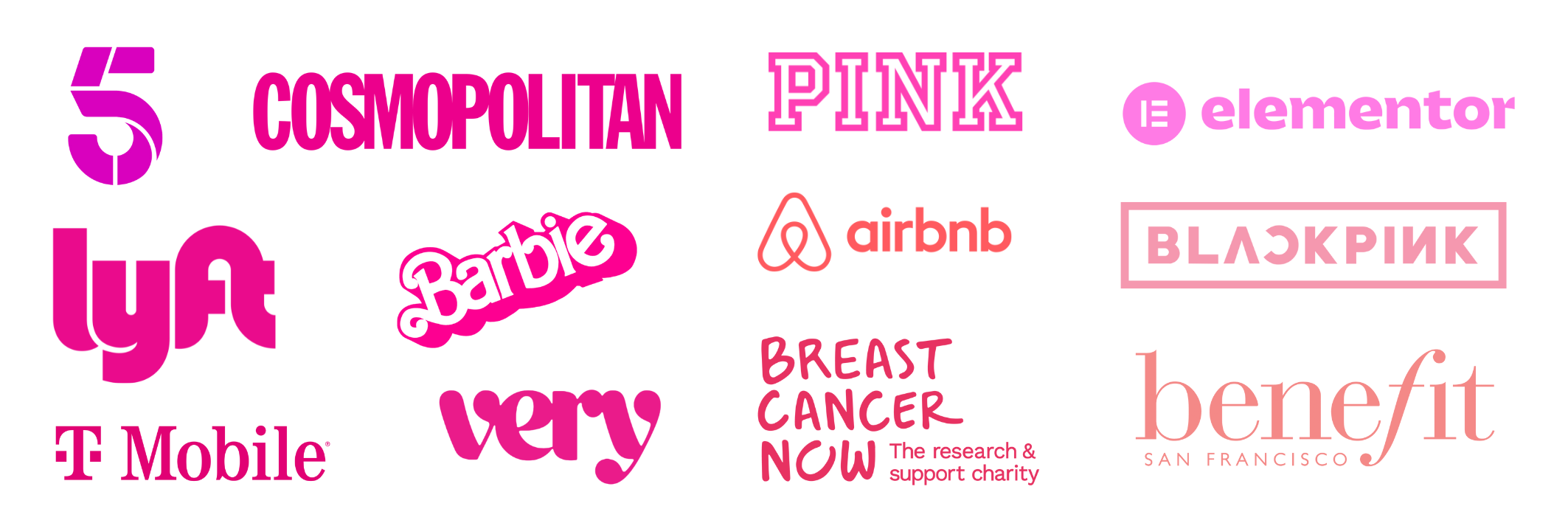
Famous Pink Logos
Pink Colour Psychology
In branding, pink is the colour of charm, playfulness, and sweetness. It's like a breath of fresh air in the world of branding, often associated with qualities like affection, compassion, and youthfulness. Brands which use pink are typically looking to convey a sense of warmth and approachability, making it a popular choice for companies in industries related to fashion, beauty, and lifestyle. Pink also has a strong gender association with femininity and is often used in products and services targeting a female audience.
However, it's important to use pink strategically, as its associations can be polarising, and overuse can risk appearing overly frivolous.
Popular brands which use pink in their branding include Barbie, Very and Cosmopolitan.
The Personality of the Colour Pink:
Femininity
Nurturing
Compassion
Love
Playfulness
Romance
Innocent
Optimistic

Famous Grey Logos
Grey Colour Psychology
Balance, neutrality and sophistication: this is what grey means in branding.The colour is often chosen by brands wanting to convey a sense of professionalism, timelessness and maturity, making it ideal for car brands. Grey provides a clean and neutral backdrop that allows other colours and elements to shine, making it an excellent choice for brands that want their products or services to take centre stage.
Popular brands which use grey in their branding include Wordpress, Jaguar and Wii.
The Personality of the Colour Grey:
Control
Reliability
Practical
Intelligence
Professional
Mature
Calm
Understated
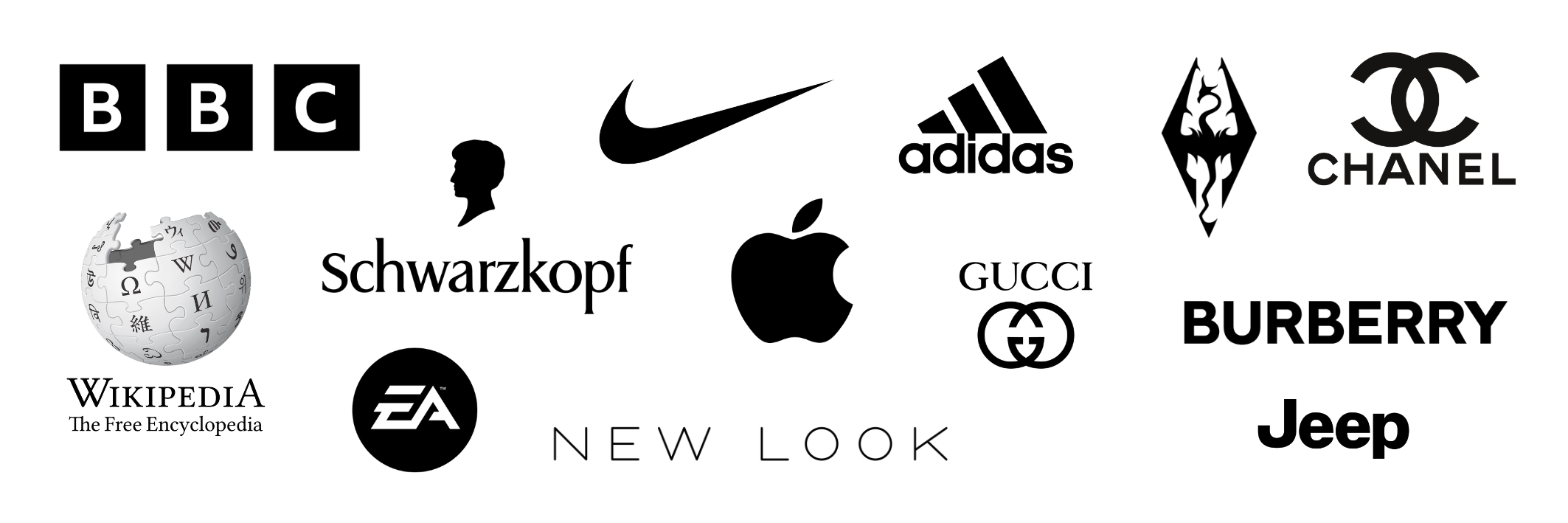
Famous Black Logos
Black Colour Psychology
Brands incorporating black into their identity often seek to convey a sense of exclusivity and prestige, which is why you often see luxury brands using it in simple, but impactful, logos. It can be daring to use black, and only black, in a logo, without having any bright colours to draw the eye. Therefore, black is often used in combination with other colours due to the strong contrast it creates - it can make other colours and design elements pop.
Popular brands which use black in their branding include BBC, Chanel and Nike.
The Personality of the Colour Black:
Power
Elegance
Sophistication
Formality
Strength
Authority
Exclusivity
Famous Brown Logos
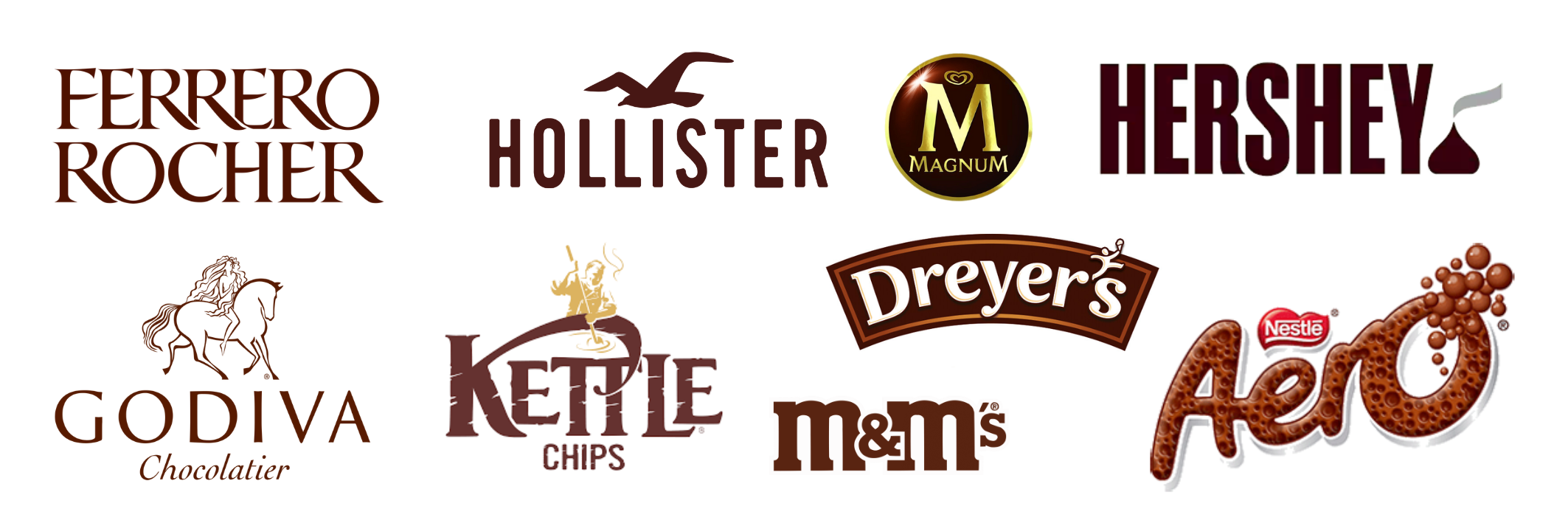
Brown Colour Psychology
Brown is the earthy, dependable and comforting colour. It's reminiscent of nature, stability, and reliability. Brands that choose brown often aim to create a sense of trustworthiness and authenticity. It's commonly associated with products or services that have a rustic or natural appeal, such as organic foods or outdoor gear. Brown can also convey a feeling of warmth and cosiness, making it suitable for brands in the hospitality or home goods industries.
The use of brown for chocolatiers cannot be ignored - some of the biggest chocolate brands use some form of brown in their logos.
Popular brands which use brown in their branding include M&M’s, Hershey and Magnum.
The Personality of the Colour Brown:
Reliability
Honesty
Comfort
Nature
Grounding
Warmth
Safety
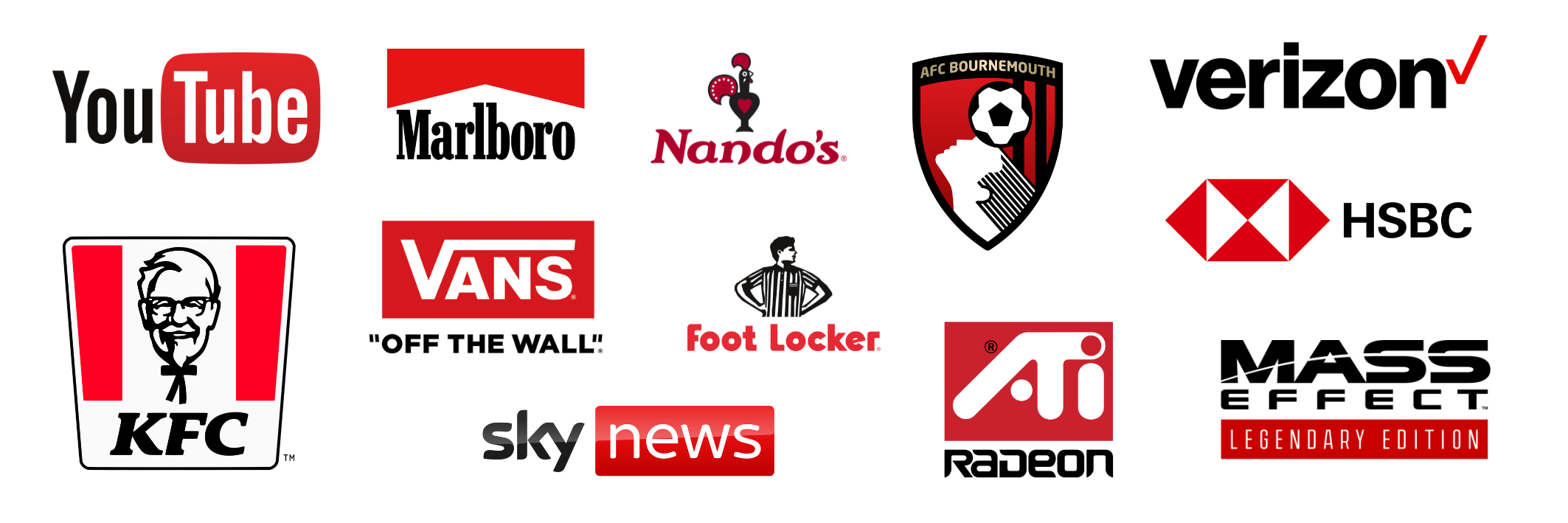
Famous Black & Red Logos
Black and Red Logos
The elements of black in these logos brings a sense of authority to the passionate red. It also allows for the addition of more complex or detailed elements, such as the portraits in Footlocker and KFC. Black and red logos appear more formal than red logos, and more energetic than black logos.
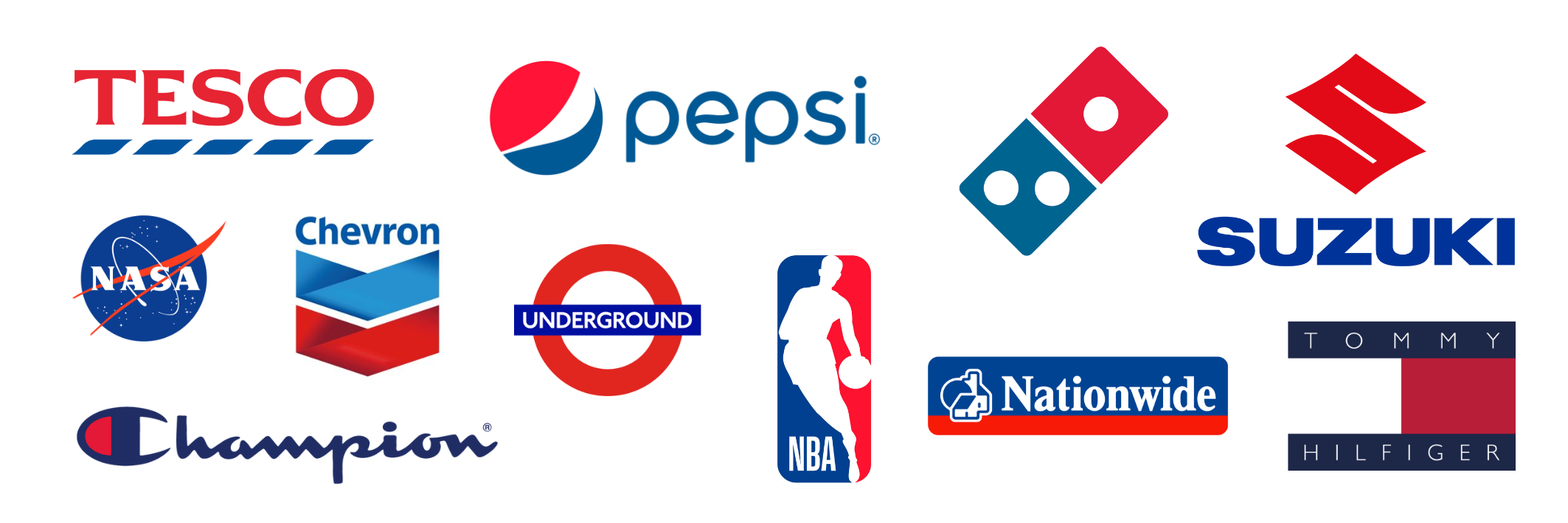
Famous Blue & Red Logos
Blue and Red Logos
The elements of red in these blue and red logos play a similar part to the previous examples of black and red logos. They bring more excitement and energy to the logo, with the blue acting as a calming anchor. This results in logos which convey feelings of determination and confidence. Blue and red are also often found, alongside white, in logos associated with the UK and USA due to the presence of these colours in the flags. You can see this in the NASA, the NBA and the Underground logos.

Famous Blue & Yellow Logos
Blue and Yellow Logo Meanings
The blue and yellow combination conveys optimism and trustworthiness, with the more serious blue calming down the more playful yellow. Blue is a popular choice for financial services, and yellow can be brought into the logo to make it feel more approachable as shown in the Visa logo. Other logos featuring both blue and yellow include Ikea, Walmart and Pokemon.
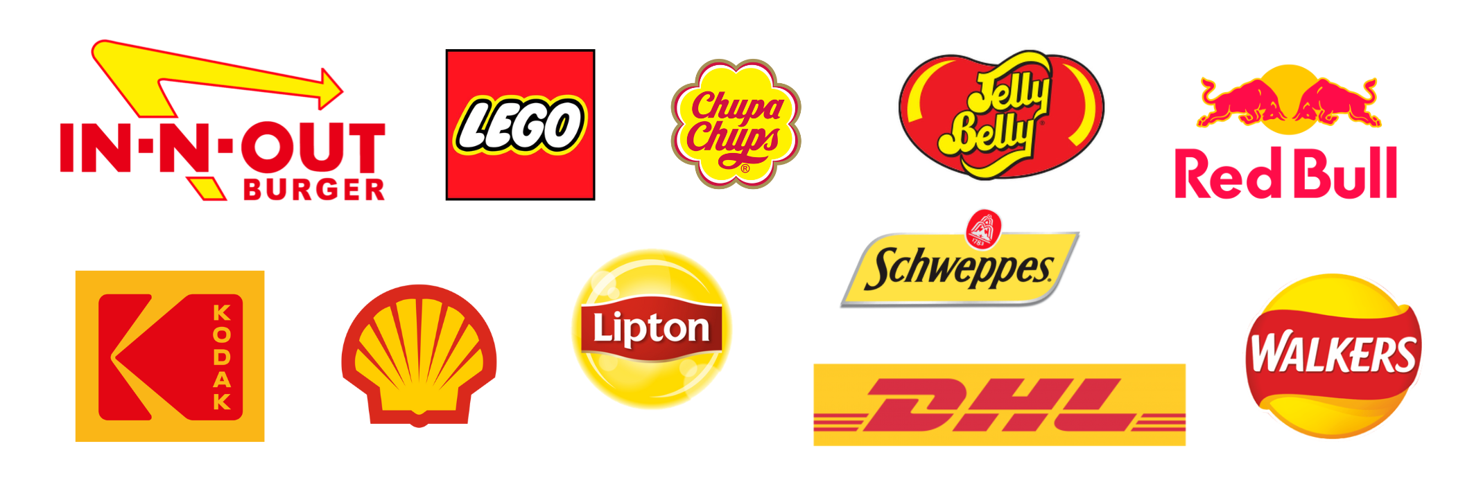
Famous Yellow & Red Logos
Yellow and Red Logos
Yellow and red are a common colour combination in the world of branding. The combo takes the playfulness of the yellow and the energy of the red - the effect is often used by food and toy brands, like Jelly Belly, Walkers and Lego. However, this doesn’t mean the colours aren’t appropriate for other brands such as Shell, Kodak and DHL.

Famous Green, Yellow Blue & Red Logos
Red, Green, Blue and Yellow Logos
This colour combination isn’t used by different brands that often - however, we see it all the time, due to the success of many who choose to adopt it such as Google and Microsoft. These logos are confident yet approachable, playful yet trustworthy, powerful yet calm. These four base colours are often used in tandem with other colours such as black and purple.

Famous Green & Yellow Logos
Yellow and Green Logos
The optimistic, youthful yellow marries the calming green to create happy logos with links to nature and the environment. Logos like Sesame Street and Duolingo use light hues to lean more on the playful sides of these colours, whilst logos like John Deere and Knorr use darker green in particular to strengthen their association with the environment.
Do You Need Help Creating The Perfect Logo For Your Brand?
At UNBXD, we have a team of design experts on hand to create recognisable, distinctive logos in line with your brand’s identity. Our brand identity services also include brand naming, brand guideline design, brochure design, signage design, packaging design and brand consultancy.
