
Analysing Rebrand Failures - What Went So Wrong?
A couple of months ago, we took a look at some of the best rebrands around. From Starbucks’ slow streamlining of their logo to the pivot towards healthiness from McDonald’s, these brands managed to figure out exactly what the consumer wanted before the consumer even knew it themselves. Since their rebrands, the brands we covered in that blog have been on an upwards trajectory, many of them leading the way in their respective industries.
But not all rebrands are so successful, and unfortunately for the following brands, a failed rebrand is hard to forget. And consumers are notoriously unforgiving when you’re messing around with the brands they know and love.
Let’s take a look at some of these failed rebrands, and discuss what went wrong, and the cost: both in terms of money and following.
Gap’s logo change, which lasted a week
When I was a teenager, I was definitely guilty of changing my Facebook profile picture only to revert it back after a few hours when I realised it wasn’t an improvement.
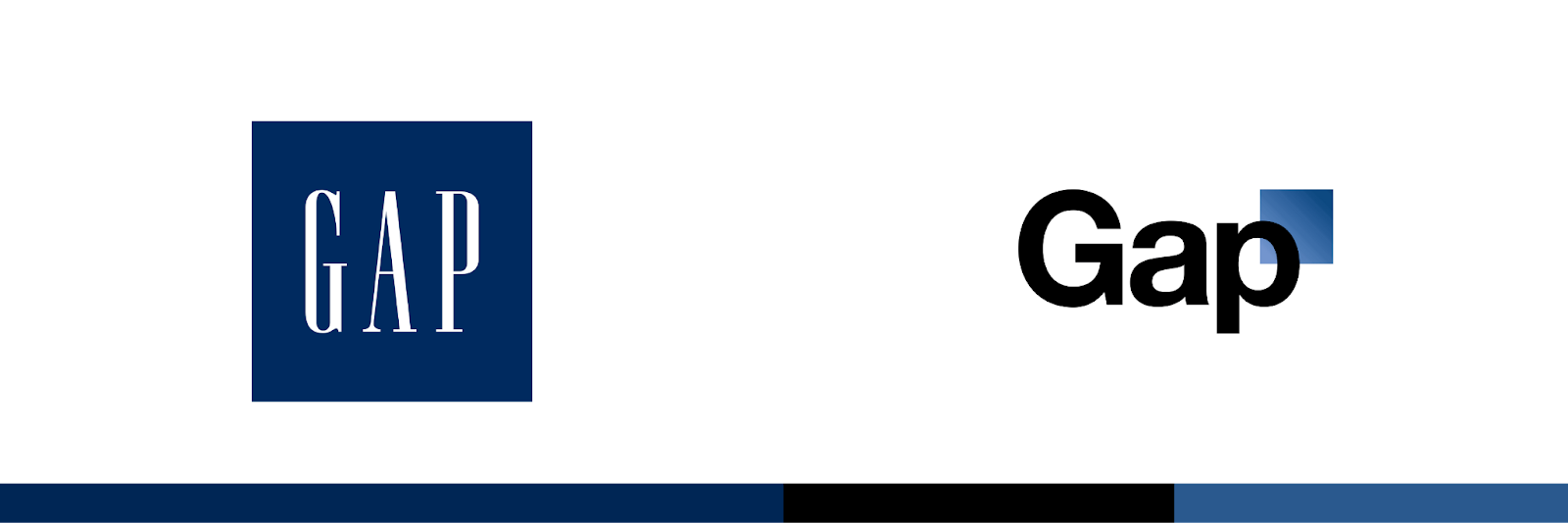
Gap’s 2010 rebrand is the corporate version of this. They’d been experiencing lower sales following the 2008 financial crisis, so decided a rebrand was in order to get those numbers back up again. And so on the 6th October 2010, they changed their logo from the one they’d had for 20 years to what became a Helvetica disaster.
The previous logo used a white serif font against a navy square. This was replaced with the new logo practically overnight, on shop fronts and across Gap’s online presence. This new logo, which cost Gap around $100 million (£78 million), featured a black, bold sans serif font - Helvetica, which is notoriously overused by many big brands - with a small blue square behind it.
At the time, Gap explained they felt this was much more modern and contemporary, leaving behind the ‘classic, American design’ with just a small ‘nod to the past’ with the blue square. But consumers didn’t feel the same: many felt it was just a change for the sake of making a change, and didn’t represent a meaningful shift within the company or their products.
Less than a week later, the logo was reverted to the time-tested navy square, and Gap hasn’t changed their logo since. And more than a decade later, we’re all still talking about it!
Gap’s Rebranding Mistakes:
They failed to warn consumers about the change before it happened, and didn’t release any justification or explanation for it, leaving customers confused.
No tangible changes in their products or company as a whole accompanied the new logo, which meant customers felt there was no real need for the change.
The logo was centred around the font Helvetica, which was already considered outdated.
Royal Mail’s change to Consignia and back
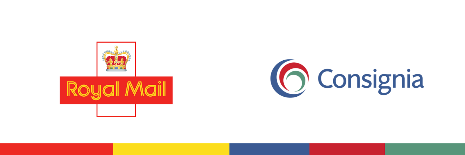
Did you know that Royal Mail once attempted to change their name to Consignia?
If your answer is no, we can’t blame you - the £2 million change barely lasted more than a year before the company reverted to Royal Mail after reporting a £1.1 billion loss, axing 15,000 jobs, and the loss of their CEO. Whilst the upfront cost of the rebrand may not have been as staggeringly large as Gap’s, the losses Consignia faced during their short run were massive.
The reason behind the original change was the breadth of Royal Mail’s services, and how the name didn’t encompass everything they did. The company felt Consignia still portrayed feelings of royalty and majesty - thanks to the inclusion of the word ‘insignia’ - and that it was more appropriate for their goal of international expansion.
As well as the new name, the company totally transformed its logo and brand colours from the iconic Royal Mail red and gold to a darker blue, red and green.
After the departure of their CEO John Roberts, former Asda boss Allan Leighton took over the company, and he didn’t hide his distaste for the new name. The loss they were now making in the UK meant the company also abandoned its plans of international domination, which meant reversion to Royal Mail was the clear route forward.
And so 16 months after the change to Consignia, the name and logo went back to the nationally recognised Royal Mail.
Royal Mail’s Rebranding Mistakes:
The new name had no clear relation to what everyone associated the company with - which was postal services.
They failed to grasp the attachment consumers had to the historic name - Royal Mail has a rich history, with the name first associated with the brand hundreds of years ago.
They underestimated the power of being a household name.
Tropicana’s accidental value brand vibes
Tropicana has always been one of the more expensive orange juice brands - at Tesco, for example, a 900ml carton of Tropicana will set you back £3, whilst the supermarket’s own brand costs less than half of that. To charge a premium, a brand has to be premium, and this was the feeling portrayed by Tropicana’s branding until they decided to undergo a rebrand in 2009.
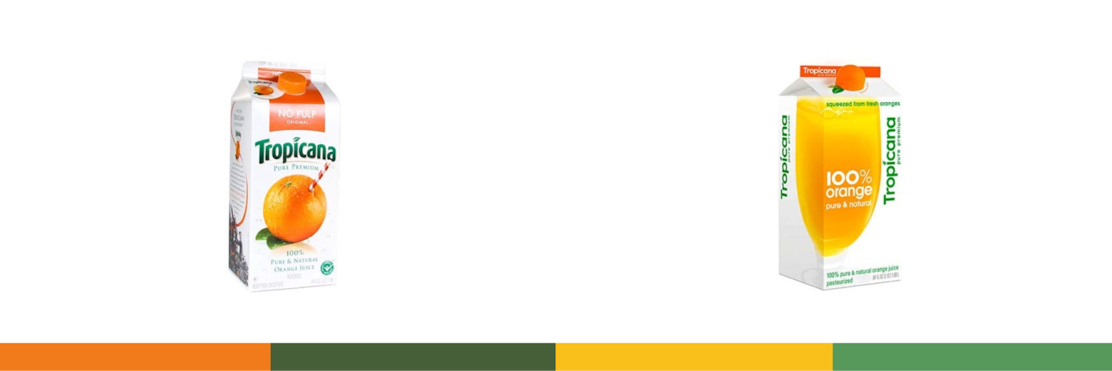
Tropicana’s existing packaging featured an orange with some leaves and a straw, which gave consumers the impression of juice so freshly squeezed it’s like plucking an orange from a tree and drinking from it. Tropicana built their brand identity using the deep orange mixed with the dark green of the logo, so when these classic cartons were replaced with their new design, it didn’t go down well.
The new design featured a new logo in a lighter green, which was positioned vertically, making it hard to read without tilting your head. The fresh, ripe orange was replaced with a glass of orange juice, which just didn’t evoke the same feelings of fresh quality as the original design.
Consumers felt the new design looked like any other discount or value brand on the shelf; it was too simple, and some even described it as ‘silly’. The first thing you read when you see the carton was no longer Tropicana - it was ‘100% orange’, and this only added to the confusion of the brand’s customers.
Prior to the rebrand, which cost Tropicana more than £27 million, the brand had reported a sales revenue of £550 million. The redesign caused sales to drop by 20%, and Tropicana then reported a £23 million loss.
Tropicana’s Rebranding Mistakes:
The packaging was unrecognisable. The brand identity they had built up over so many years was completely removed.
They underestimated the emotional attachment customers had to the image of the ripe orange. Even if we didn’t realise it, the design was subconsciously telling us the product was fresh and high quality.
The design was spread across the front and side of the carton, and in order to get the full effect of the glass, you needed to be able to see both. But that’s not how cartons are lined up on the shelves, is it?

Twitter. Need I say more?
Elon Musk’s infamous rebrand of one of the most well-known social media platforms in the world is a lesson in the power of a strong brand identity. Even now, we’re all still calling X ‘Twitter’. We’re still posting ‘tweets’ and ‘retweeting’. The iconic blue bird may be gone, but it’s still in our hearts.
Not only was this well-established, loved brand completely abandoned, but its replacement has left a lot to be desired. X is an awkward name at best - awkward to say, awkward to search for - but its issues run far deeper than that.
A brand identity - which is made up of everything from their logo and name to their colour palette and typefaces - is best when it invokes positive feelings. The letter X is used in so many different contexts. XOXO. X marks the spot. The X Files. The X-Factor. And you know in cartoons when a character dies and their eyes are replaced with… an X?
Everyone has their own associations with the letter, which means the brand has little control about how it’s interpreted. This makes it incredibly difficult for X to create a strong, cohesive identity.
But the clunkiness of the rebrand doesn’t end there. As of March 2024, X.com still redirects to Twitter.com, which is bizarre. The launch was very clumsy, and even after nearly a year, the many issues have still not been ironed out.
X’s Rebranding Mistakes:
Musk seemingly disregarded the sheer popularity and strength of Twitter’s brand - or underestimated its power in keeping its users on the platform.
The decision to use the letter X, which has many varying interpretations, means it’s nigh on impossible for X to build a clear, strong brand identity anything like Twitter’s.
The change to X was accompanied by many other unpopular decisions. Combined with the increased amount of spam and bots, in part due to X’s subscription tiers, the landscape is pretty unrecognisable, and users aren’t happy.
Want to avoid the mistakes these brands made?
At UNBXD, we have a team of design experts on hand to create recognisable, distinctive logos in line with your brand’s identity. Our brand identity services also include brand naming, brand guideline design, brochure design, signage design, packaging design and brand consultancy.
